Color Pops
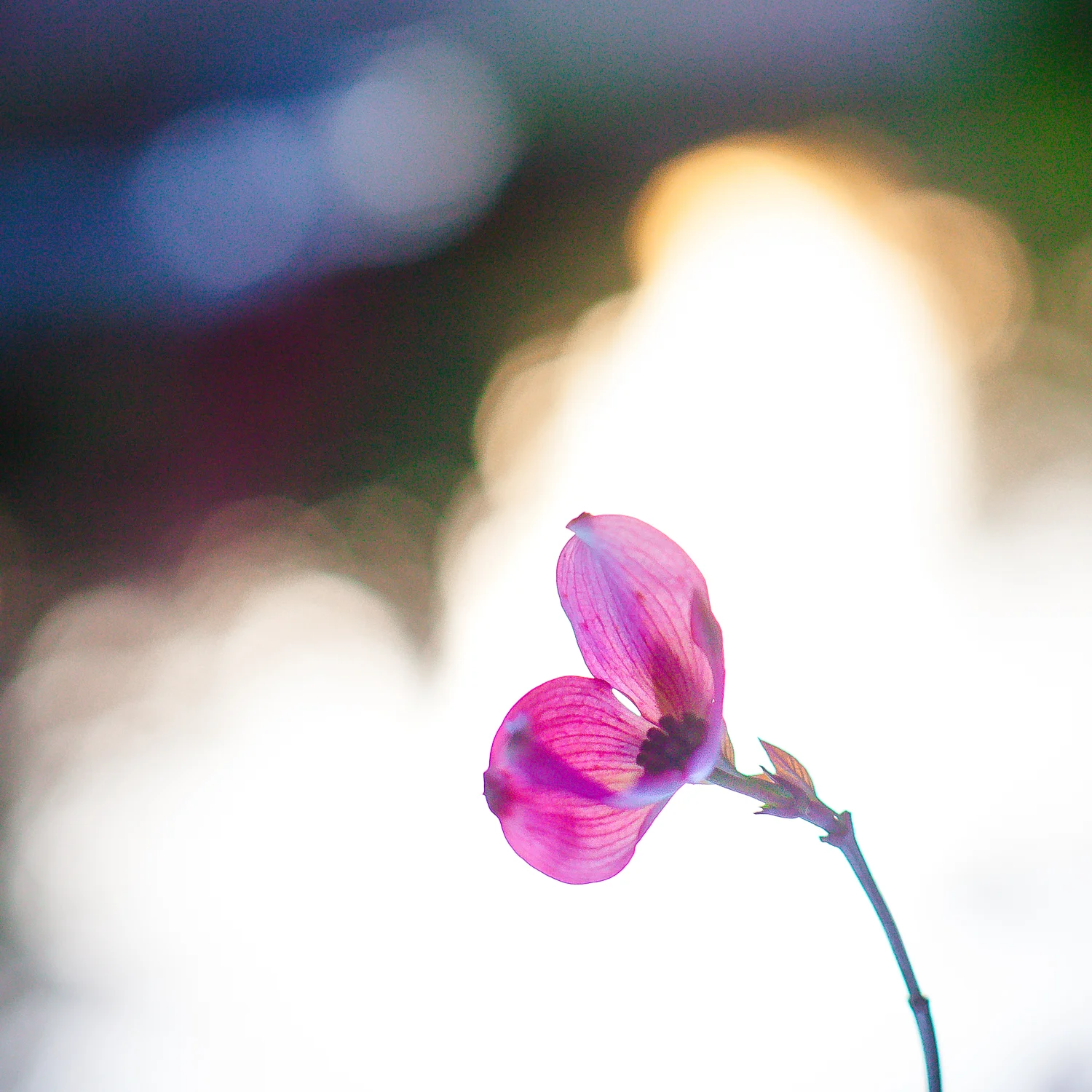
I have a never ending love of all things color. My eyes see bright colors, and my edits reflect that for sure. I always admire rich, dark, emotive post-processing edits that some photographers create. Yet while I love to see these images flowing through my Instagram feed, I rarely try to emulate them because they are just not "me." I love bright color almost as much as I love light, and the combination of the two is amazeballs to my heart (see above).
Color Theory
There is SOOOO much I could cover on this subject. Color theory is an endless study. However, this post is due up in 12 hours, and I'd like to sleep tonight, so I won't really have time to go into much about color itself.
I know that Kelly has studied some color theory, and I can't wait to see what she photographed when she visited Eastern Oregon this month. Check out her post.
Briefly to just touch on color in general ...
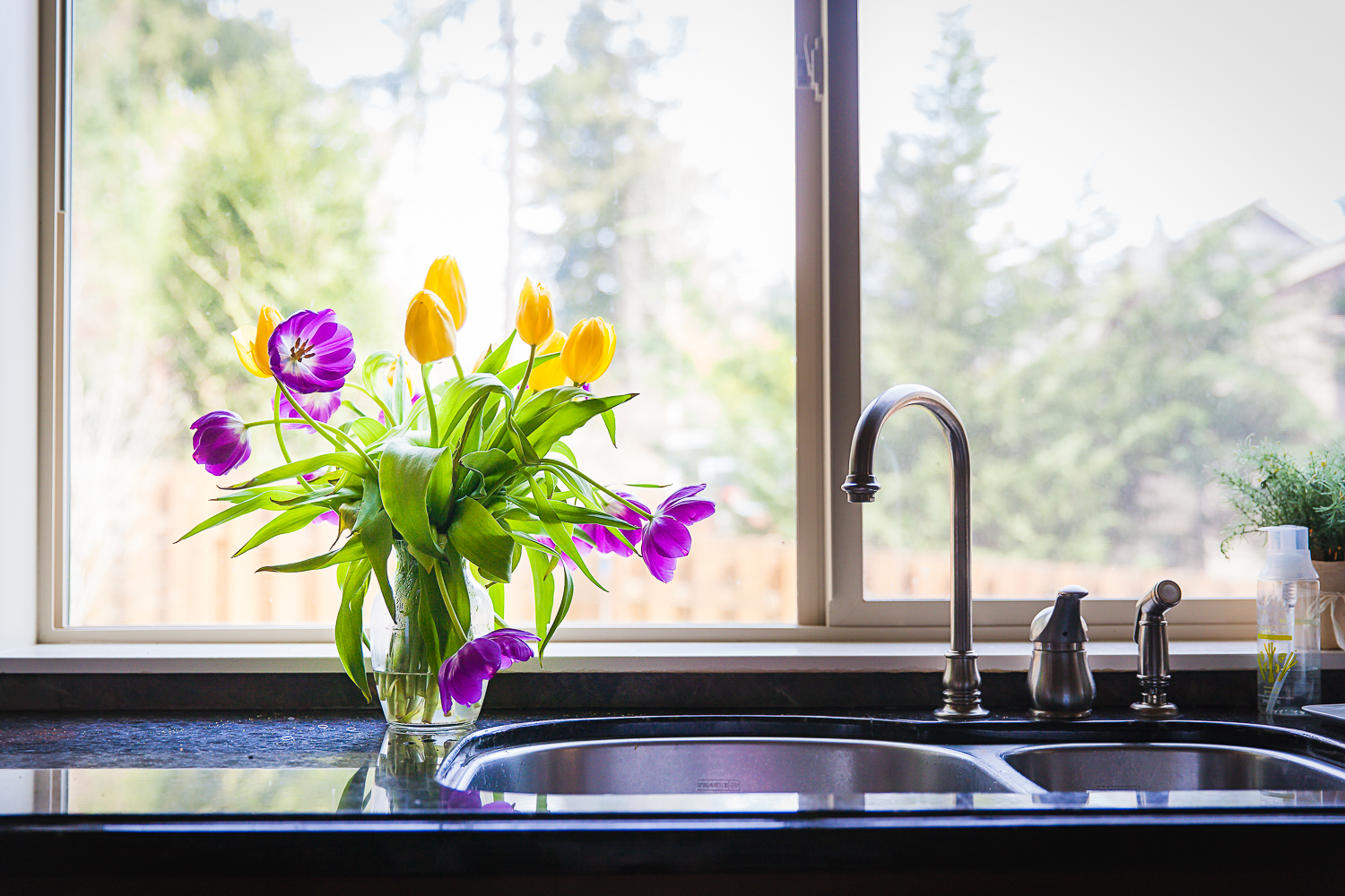
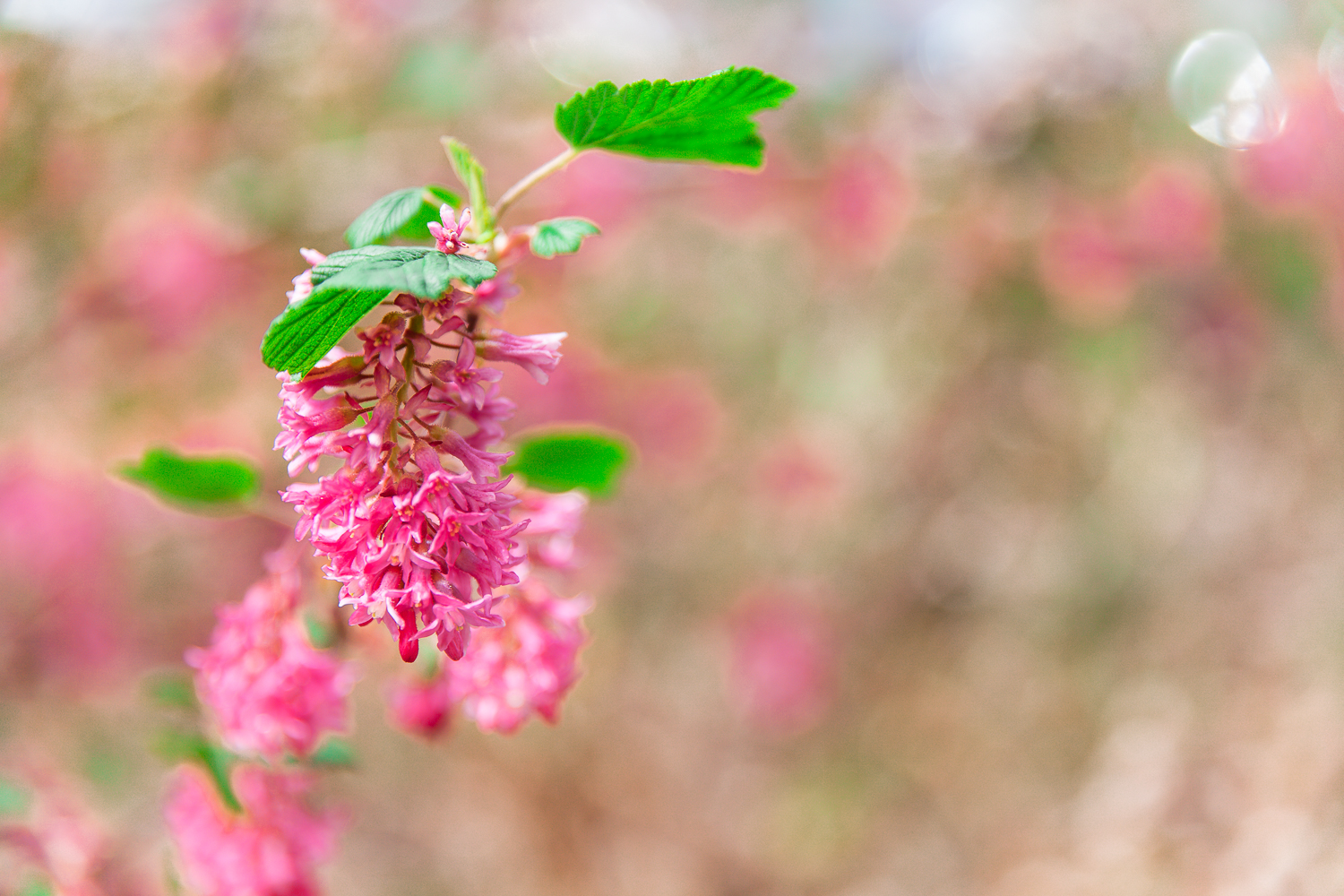
Do you like teal and orange paired together? How about purple and yellow? Pink and green like the tulip photo above? It's not just you! It's actually a thing.
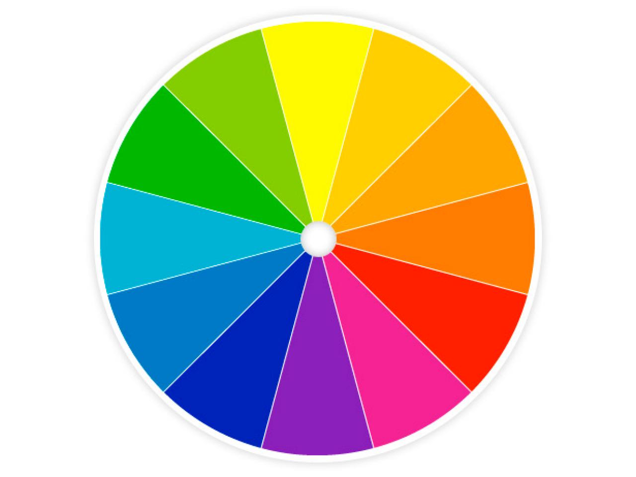
Do you remember learning about the color wheel back in grade school art class? The colors across from each other compliment each other. You can use that concept to add interest to your photography. Again, there is so much more science behind color, but here are a couple of quick examples.
Art over theory
Sometimes all of the theories of photography can be so intimidating. What I hope to communicate is that while these theories exist and can augment your work, they are definitely not necessary to create emotional, meaningful, beautiful images even if you are using the camera on your phone.
Thankfully for those of us who don't have hours to spend on understanding theory, rules were made to be broken. Color is God's gift to us of an absolutely endless palate of creativity. Also, just like in language, there are so many ways to communicate. So find your voice and use it.
Composition
My mantra for every single photographer is that composition is the absolute most important thing. You can have the most adorable, original subject, but if you compose the photo poorly, you will be let down by your result. This is so much harder than anyone who does't do photography can appreciate. Just as athletes or musicians make their skills look easy, if you see a photo that you like, you can probably be sure that it took a few tries to get it right.
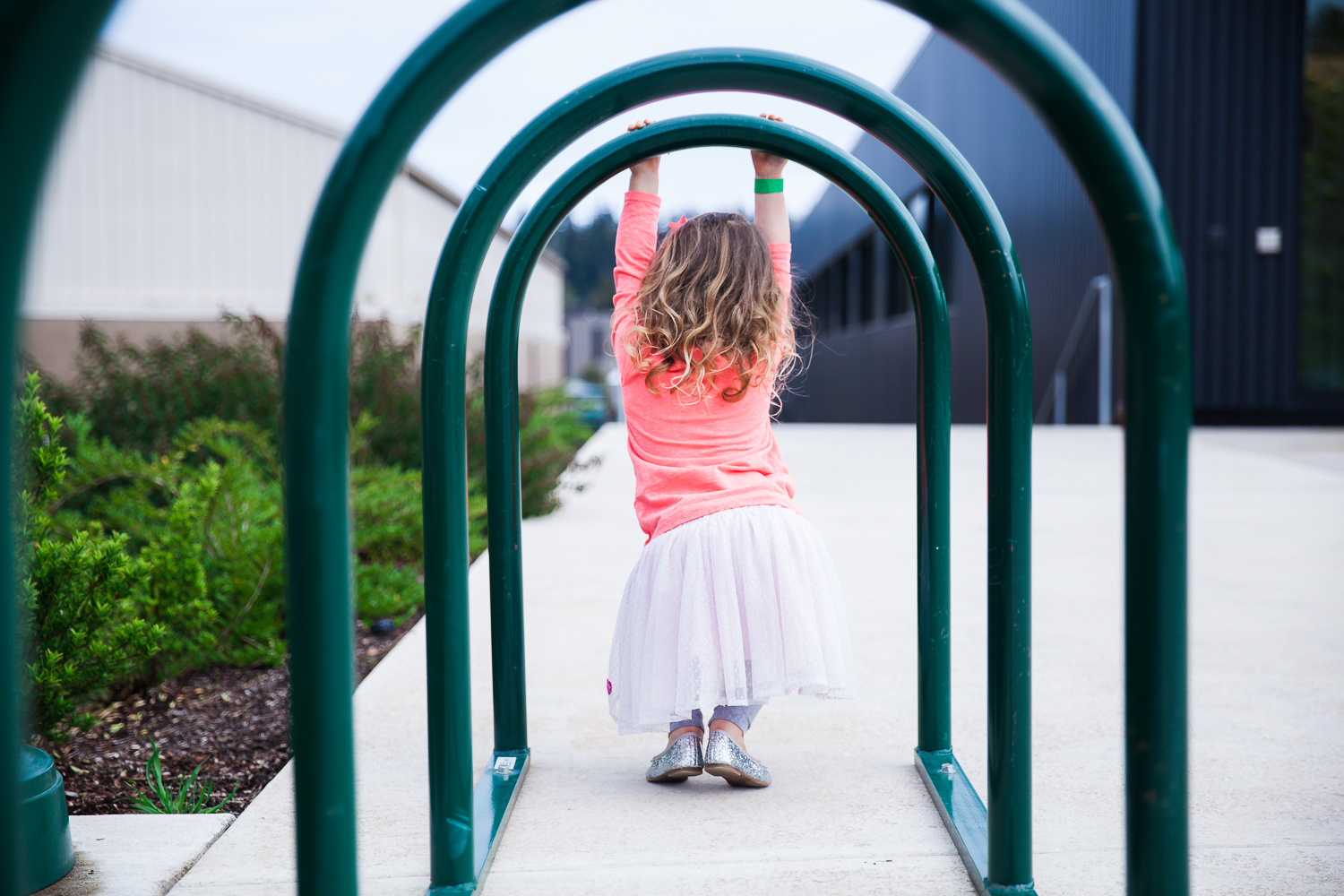
This next one is one of my all time favorite color pop photos. It plays on color theory, leading lines, the rue of thirds, and more. I remember what a pain it was last June to haul my camera out to the strawberry fields, but it's shots like these that make it totally worth it. I'll cherish this memory forever. Shout out to Unger Farms which is gorgeous and a wonderful family owned place to pick berries in a few short weeks!
It took me several attempts to frame this photo exactly the way I wanted it. If I was too close, it was just a vase of flowers (vs providing context). If I was too far back, the flowers weren't enough of a strong subject and the photo looked busy. There are a lot of lines in this scene, both horizontal and vertical, so it was tricky to frame and align everything in a way most pleasing to the eye. I could go on and on unpacking the composition of this shot, but just know that even the simplest image can take a ton of trial and error before you tell the story you wanted to tell when you thought to take the picture. Here, I wanted to convey that someone got a nice bouquet of flowers to brighten up otherwise mundane kitchen sink work.
I'm lucky enough to have beautiful Oregon trees outside of my kitchen window, but you absolutely don't need a beautiful landscape to give your photos a clean composition. You can even use color to be your backdrop.
As long as the composition is pretty, you don't need anything fancy. You can even have a busy or messy background and still create a cool pop of color photo. The shot below is just from a street complete with cars, fences, and distractions. But I love that the center of the photo is this grouping of red and black and grey. It just works as a color pop photo even though the photo itself contains all the colors.
Whatever your background, put it to work for you. Either use it to frame, to isolate, or to augment.
OR, crop it out! Check out this pretty patch of flowers at the base of a tree. The actual landscape had a chain link fence, but a crop that is heavy in the base looks cool and you'd never know that it wasn't in some beautiful suburban sprawling landscape.
Composition is important, but so are moments. It's often really hard to do both well. But at the end of the day, fun memories are more important than the perfect image. Just take the picture. You'll be happy to have those shots.
Click Away
This theme had me thinking of the Click Away photography conference I went to in Seattle 2 years ago for a couple of reasons. The first is because it is where I met Loren, a talented photographer from California. We got to chatting, and I have loved following her work ever since. This month, she has joined our Life from this Lens project, and I'm so thrilled!!! Click through the links (via Kelly's page at the bottom of the post) to find her work. Yay!
Second, I remember playing with color pops a lot during that conference. Here are some of my favorites from that weekend.
don't be afraid of the dark
Night photography can be AWESOME when you are looking for pops of color.
This next one is very similar to the above, but you can see a little more of the texture of the building which I liked. I like the top one because the dark is so dark that it's almost hard to tell what it is, and it looks more like a super modern painting or graphic design than a photograph.
This was just in a storefront window, and I liked the glowing color.
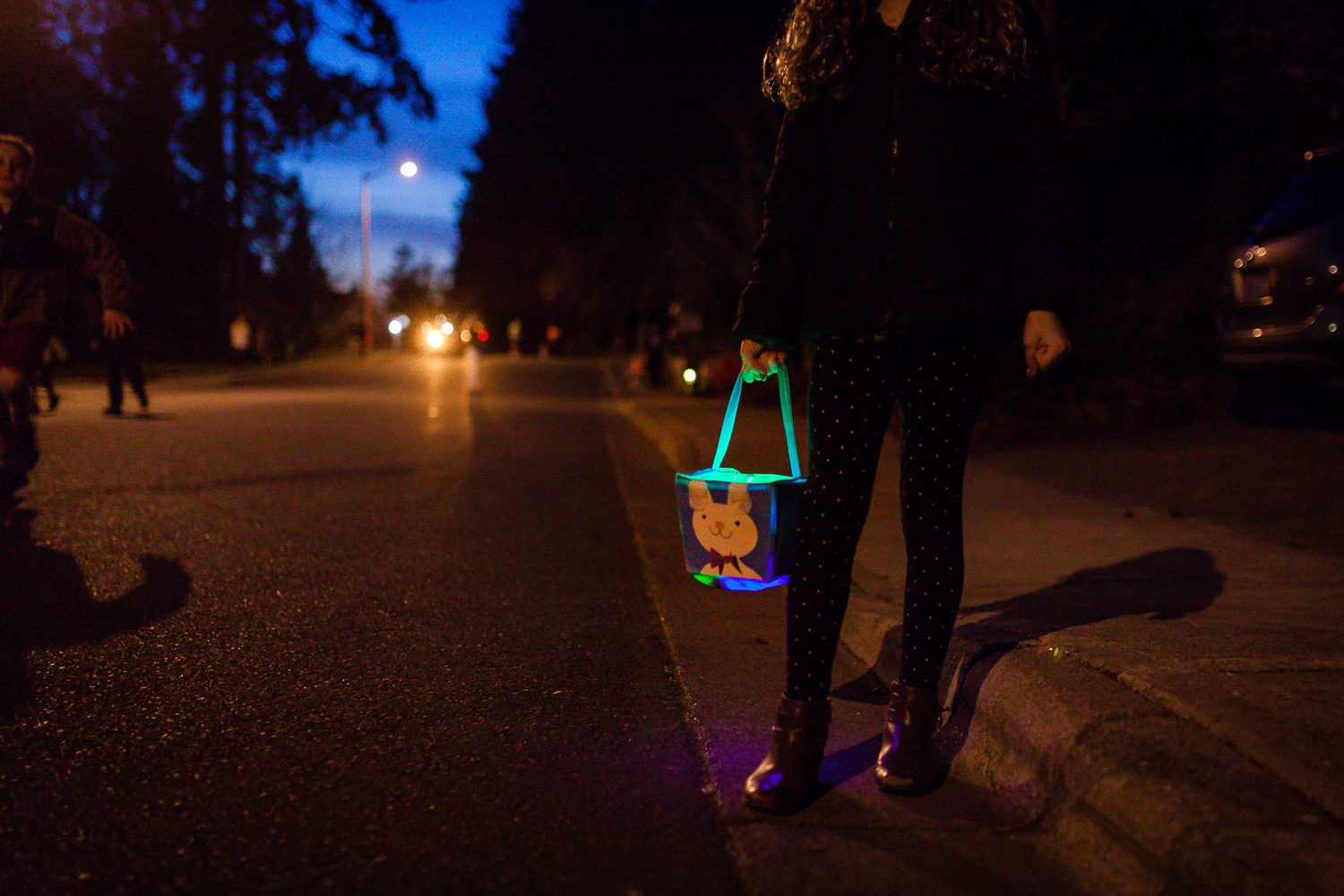
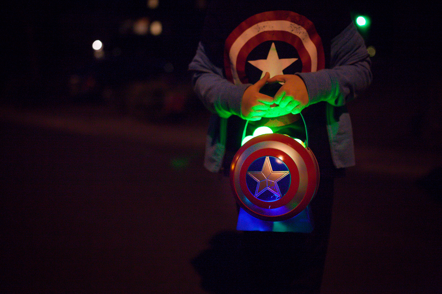
Yes, I live on the coolest street ever, and we do an annual glow in the dark easter egg hunt. It is as amazing as it looks. One of my very favorite traditions!
Look Down & Get Down
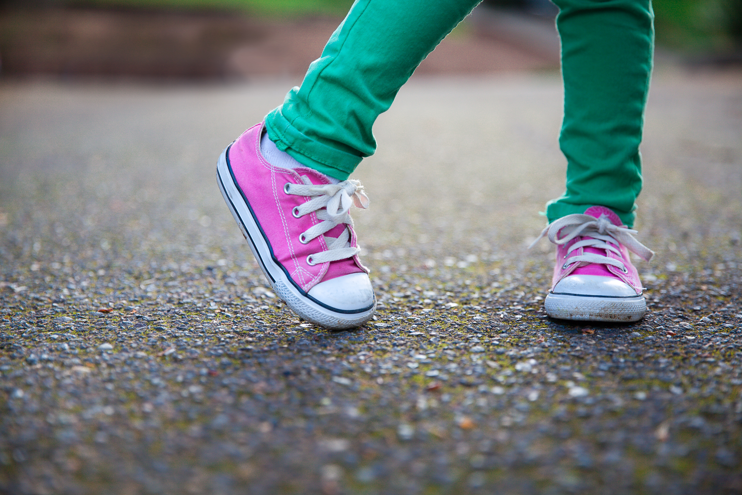
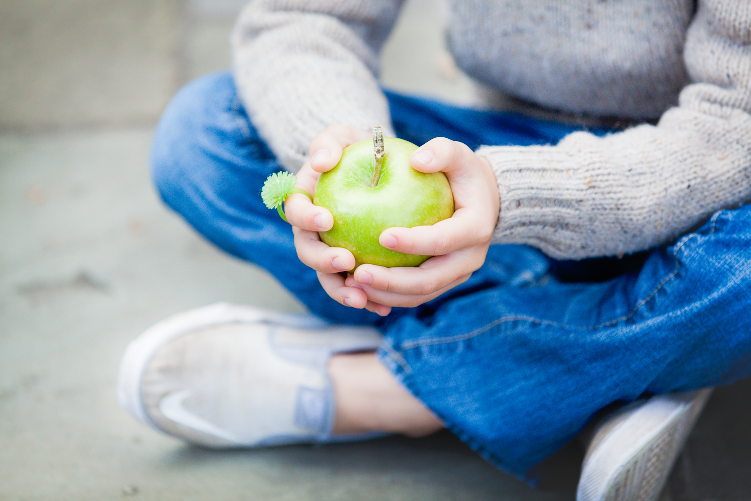
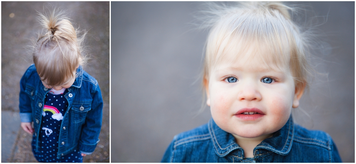
I can't give this advice enough when photographing little people. Look down! Get down ... way down! Lay on the ground if you have to but you will catch some of the sweetest details. Or just point your lens down and shoot from above.
Some of these are new, but I am also going to pull a few from the past to show what I mean. Some of these aren't really as much about the color pop but just to demonstrate that often the ground can provide a nice neutral background to help you isolate or frame your subject.
I know this shoe photos is very similar to the one above, but I loved the position of her feet and the texture of the road, so wanted to include this one too.
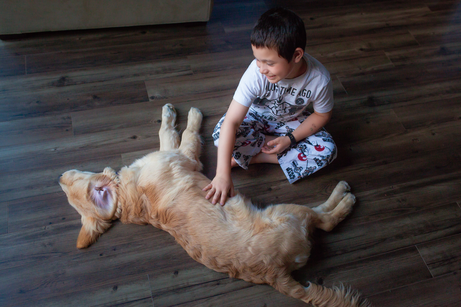
There would have been a time that I would have not posted this photo because Obi (the dog)'s tail is cut off ... but WHO CARES. It is still an adorable photo, and I like how the floor creates a neutral texture to help Obi POP in the middle of the frame.
and just look around.
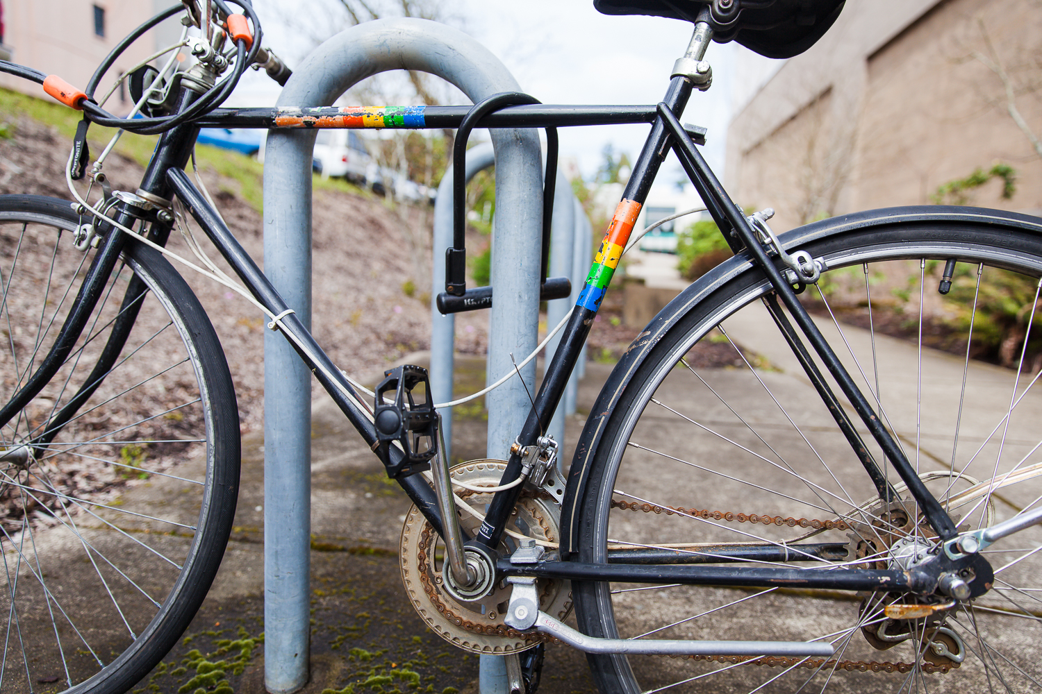
This month I really had a ton of fun composing pictures in my head even when I didn't have a camera around. I'd be driving or walking and see some perfect pop of color and think about how I would photograph it. Here are a few that I actually did have my camera on me.
Thanks for joining me in exploring color this month. Now go take pictures. And once again, don't forget to circle through and see how this fantastic group of photographers handled this theme. I can't wait! Start out on Kelly's page and circle through. Happy Spring! :) ~ Jessica


